-The Dream Cancel Wiki has successfully upgraded it's wiki software and editing has returned. Tables for data have returned.
Template:HoverImage/Documentation: Difference between revisions
Franck Frost (talk | contribs) No edit summary |
Franck Frost (talk | contribs) No edit summary |
||
| Line 11: | Line 11: | ||
== Examples == | == Examples == | ||
These examples are made with [[Template:HoverImage/Alt|HoverImage/Alt]], essentially the same template but better suited for table display. Extra text has been added to show how text wrapping around images works | |||
{| class="wikitable" | {| class="wikitable" | ||
| Line 17: | Line 17: | ||
|- | |- | ||
| Image/hitbox hover | | Image/hitbox hover | ||
{{HoverImage|02UM_Kyo_cl.A_2_ima.png|02UM_Kyo_cl.A_2.png}} | {{HoverImage/Alt|02UM_Kyo_cl.A_2_ima.png|02UM_Kyo_cl.A_2.png}} | ||
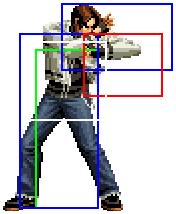
Shown on Kyo's cl.A (hover over the image). | Shown on Kyo's cl.A (hover over the image). | ||
| The simplest form | | The simplest form | ||
<nowiki>{{HoverImage|02UM_Kyo_cl.A_2_ima.png|02UM_Kyo_cl.A_2.png}}</nowiki> | <nowiki>{{HoverImage/Alt|02UM_Kyo_cl.A_2_ima.png|02UM_Kyo_cl.A_2.png}}</nowiki> | ||
|- | |- | ||
| Image/hitbox hover {{HoverImage|02UM_Kyo_cl.A_2_ima.png|02UM_Kyo_cl.A_2.png|left|100px}} shown on Kyo's cl.A (hover over the image). | | Image/hitbox hover {{HoverImage/Alt|02UM_Kyo_cl.A_2_ima.png|02UM_Kyo_cl.A_2.png|left|100px}} shown on Kyo's cl.A (hover over the image). | ||
| Extra image options (e.g. make smaller, float) | | Extra image options (e.g. make smaller, float) | ||
<nowiki>{{HoverImage|02UM_Kyo_cl.A_2_ima.png|02UM_Kyo_cl.A_2.png|left|100px}}</nowiki> | <nowiki>{{HoverImage/Alt|02UM_Kyo_cl.A_2_ima.png|02UM_Kyo_cl.A_2.png|left|100px}}</nowiki> | ||
|- | |- | ||
| Image/hitbox hover | | Image/hitbox hover | ||
{{HoverImage|02UM_Kyo_cl.A_2_ima.png|02UM_Kyo_cl.A_2.png|thumb|200px|It may look good|But it's really not}} | {{HoverImage/Alt|02UM_Kyo_cl.A_2_ima.png|02UM_Kyo_cl.A_2.png|thumb|200px|It may look good|But it's really not}} | ||
Shown on Kyo's cl.A (hover over the image). | Shown on Kyo's cl.A (hover over the image). | ||
| Captions can be changed depending on the image | | Captions can be changed depending on the image | ||
<nowiki>{{HoverImage|02UM_Kyo_cl.A_2_ima.png|02UM_Kyo_cl.A_2.png|thumb|200px|It may look good|But it's really not}}</nowiki> | <nowiki>{{HoverImage/Alt|02UM_Kyo_cl.A_2_ima.png|02UM_Kyo_cl.A_2.png|thumb|200px|It may look good|But it's really not}}</nowiki> | ||
|} | |} | ||
Latest revision as of 01:41, 28 August 2022
This template displays a default image, then substitutes another image when the reader hovers over it (e.g. if visual users place their mouse over the image). It is primarily intended for showing an undoctored image to the casual reader, but highlighting certain aspects on close inspection.
This template may hide useful information from the reader, so should be used with caution Bear in mind that the casual reader may not hover over the image, so will not see the intended effect. In addition, it may be difficult to follow links to the default image, as this will change on hovering. For this reason the images should be similar to each other (see examples below).
Usage
The template is intended to mimic the wikitext convention for images. The first two parameters are the names of the default and hover-revealed images respectively. All other parameters are the same as for images, and are applied simultaneously to both images, apart from the caption. If there is more than one potential caption, then the first caption is used for the default image and the last for the replacement image.
Template:Hover is an adjacent version of the template that doesn't limit the effect to images. It would mainly serve to display different notations.
Examples
These examples are made with HoverImage/Alt, essentially the same template but better suited for table display. Extra text has been added to show how text wrapping around images works
| Display | Markup |
|---|---|
| Image/hitbox hover
Shown on Kyo's cl.A (hover over the image). |
The simplest form
{{HoverImage/Alt|02UM_Kyo_cl.A_2_ima.png|02UM_Kyo_cl.A_2.png}}
|
| Image/hitbox hover shown on Kyo's cl.A (hover over the image). | Extra image options (e.g. make smaller, float)
{{HoverImage/Alt|02UM_Kyo_cl.A_2_ima.png|02UM_Kyo_cl.A_2.png|left|100px}}
|
| Image/hitbox hover
Shown on Kyo's cl.A (hover over the image). |
Captions can be changed depending on the image
{{HoverImage/Alt|02UM_Kyo_cl.A_2_ima.png|02UM_Kyo_cl.A_2.png|thumb|200px|It may look good|But it's really not}}
|
Limitations
- No more than 8 additional parameters after the image names. This should be enough for all the image options
- This template my need updating if the image syntax changes (e.g. more named parameters allowed)
- It may be useful to have a similar template that overlays one or more (different-sizes) pictures or text on top of the default image (e.g. for adding arrows to an image on hovering). A suggested name for this template is HoverOverlay but this has not yet been coded.
- Requires a web browser that supports the :hover pseudoclass on elements other than <a> (e.g. does not work for Internet Explorer 6)


